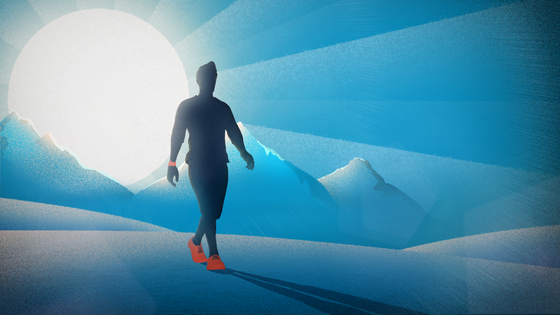
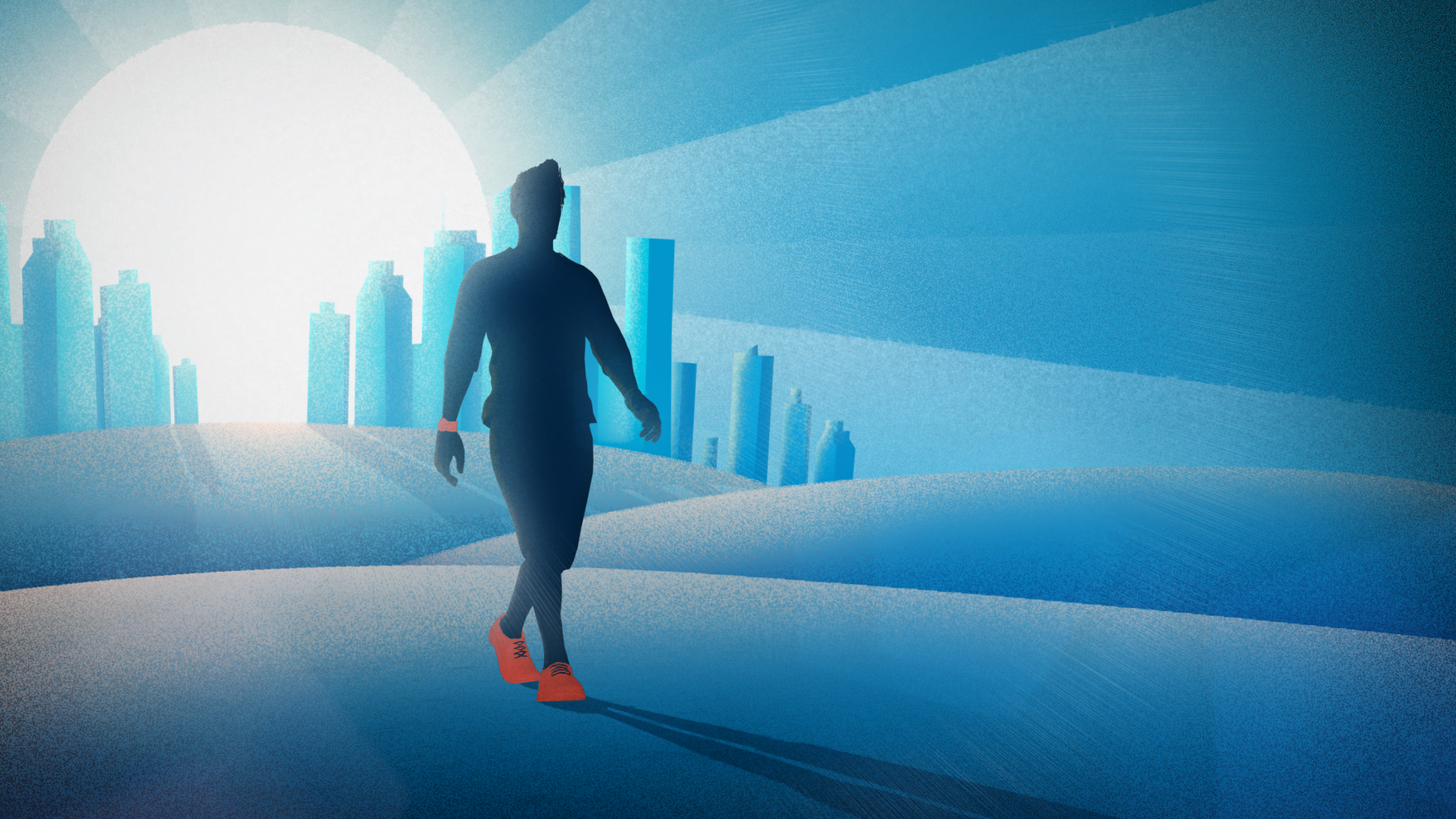
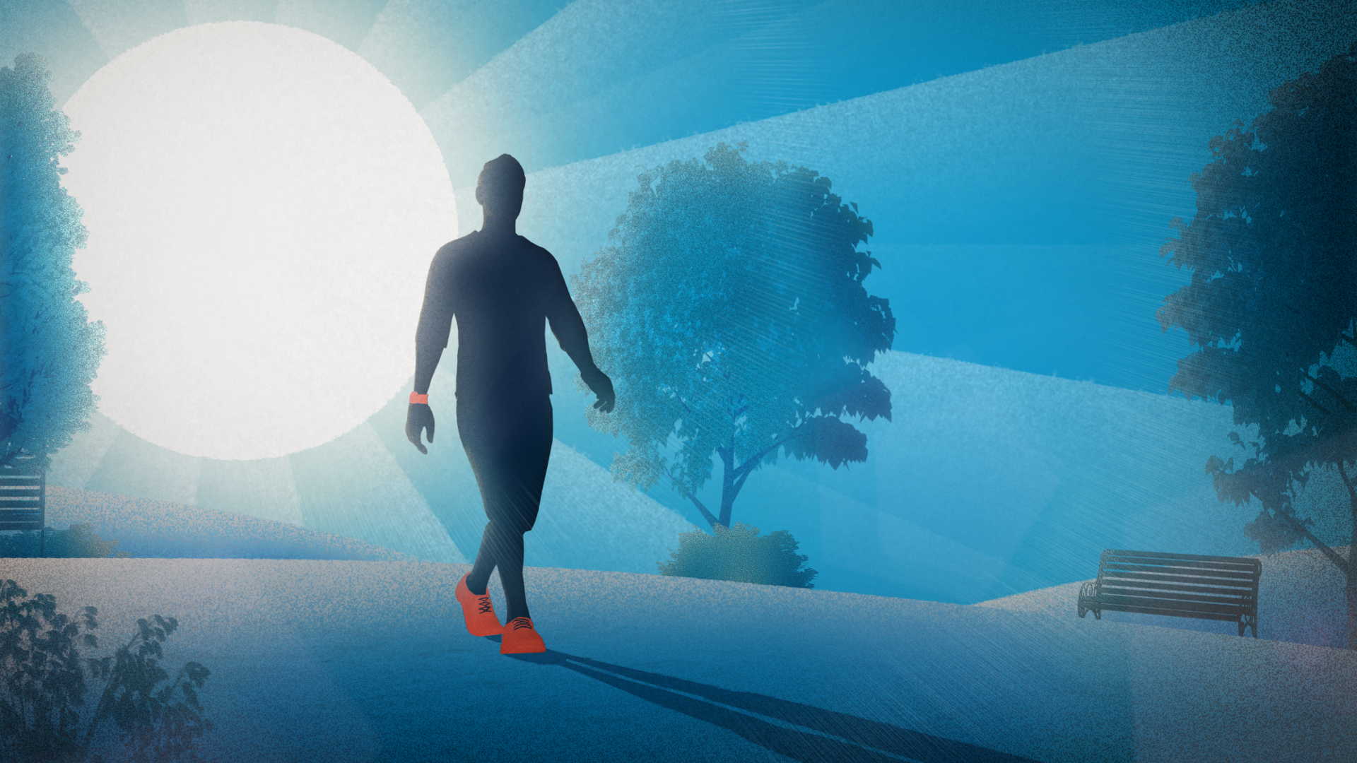
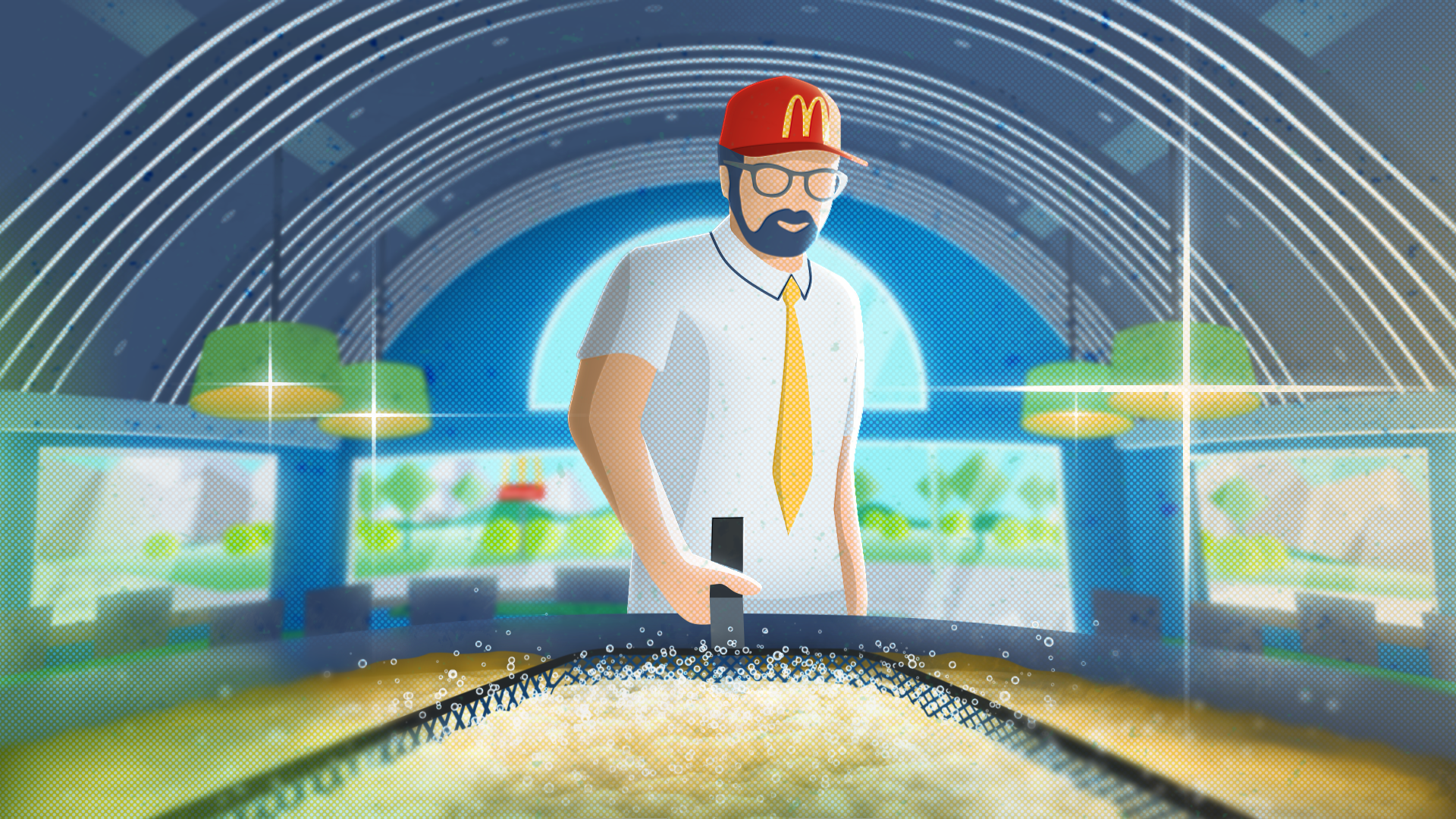
That First Frame. Process + Inspiration
Leaping from an idea to a finished animated product is impossible, even if it sounds fantastically inviting. Nowadays there’s a lot of talk about AI, and even though I’m amazed at how some artists are purposing it as a creative tool, some of its usages take out the most fun elements out of the creative process: emotion-driven inspiration and discovery. Some may disagree in their own right, and I believe this current experimentation period will help us get closer to finding the best possible uses for these technologies in the future. But personally, I wouldn’t want to replace some creation processes with writing prompts just yet.
FEELING, INSTEAD OF EMULATING
For now, even when AI is used to approach the production process alternatively (like Corridor Digital did in their own innovative approach), it usually still starts with something that’s art directed and as a result, visually represents the idea of the project best. The textbook process proposes developing concept art should be the first step in developing the building blocks of the final work: characters, background elements, props, then move on to the storyboards, layout etc.. If it’s affordable, time and/or budget-wise, sounds great! With most of the projects (especially commercial ones) that I had the opportunity to work on however, we needed to start somewhere closer to the end result skipping most (if not all) steps - going straight into Styleframes.
I would argue that in the long run, letting an AI emulate another artist’s style to define a project’s Art Direction isn’t the way to create long-lasting pieces. AI supporters might argue differently and naturally, every artist is going to try to “protect their own backyard”, but whether it’s for a commercial project or an artistic one, a styleframe / art direction is not about finding the right prompt. I believe it’s the emotion behind an artist’s inspiration and the trial-and-error process that propels creative growth. AI usage will surely evolve, and maybe even create its own branch of creation (like Toy Story did), so no artist should worry about loosing their job just yet.
WHAT INSPIRES YOU?
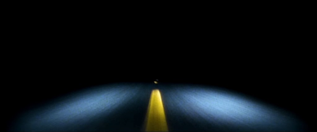
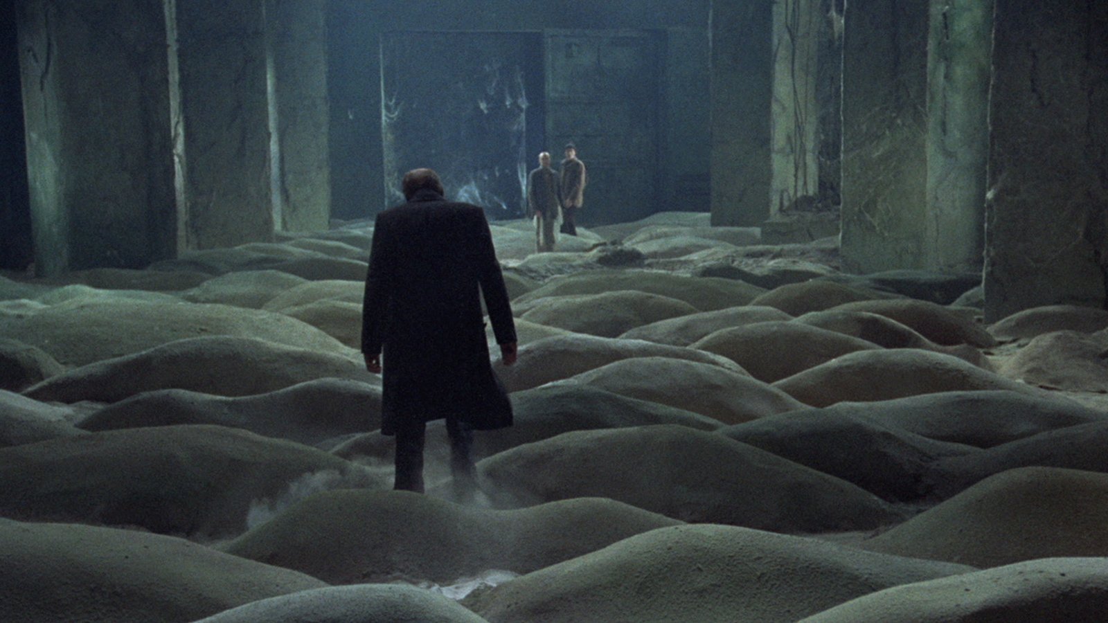
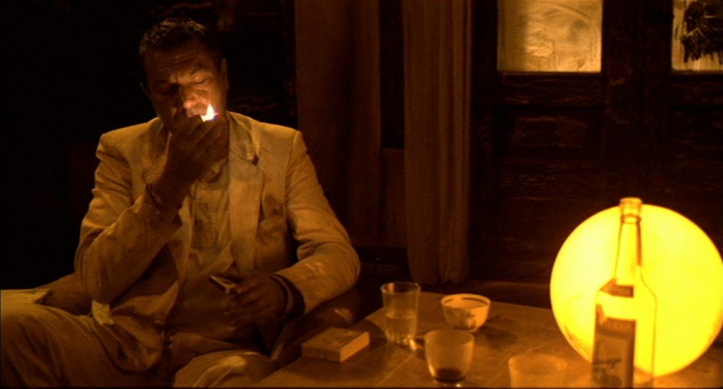
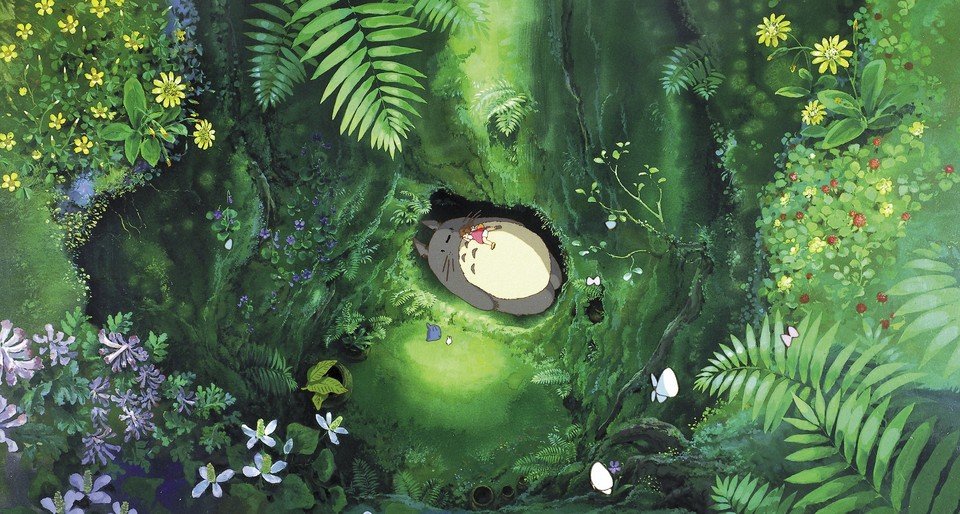
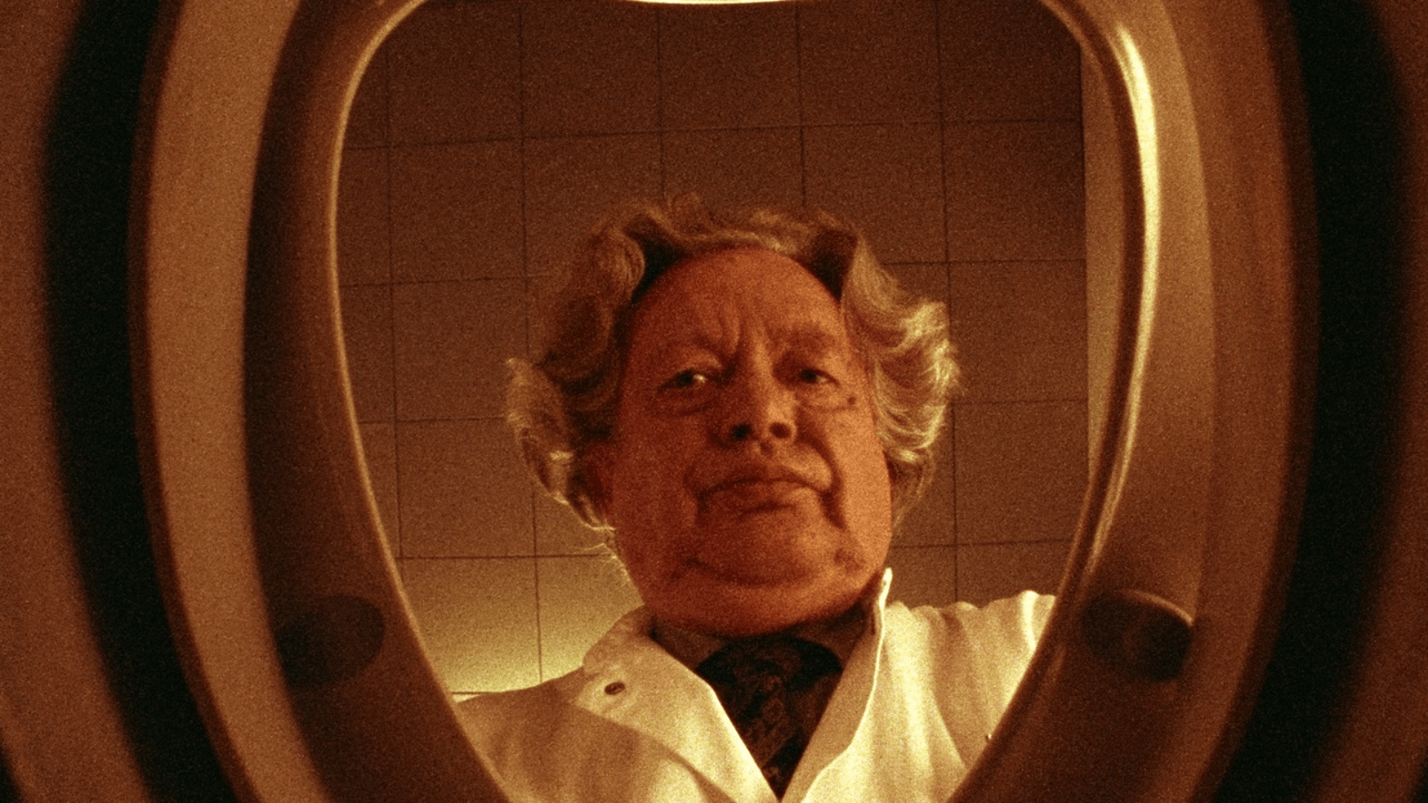
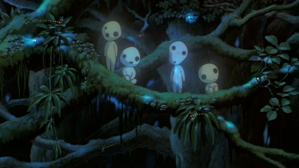
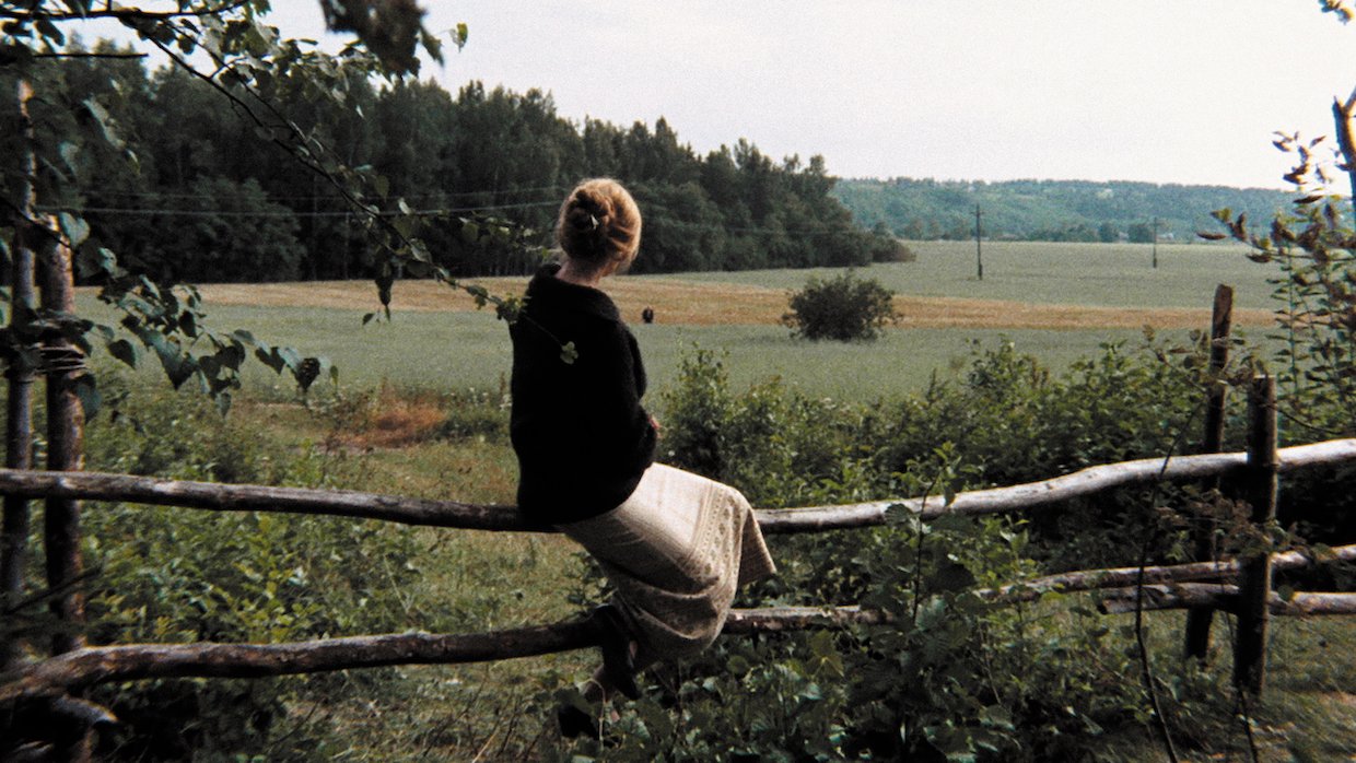
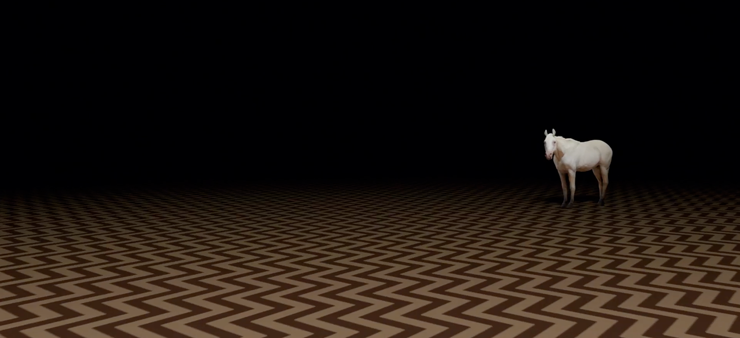
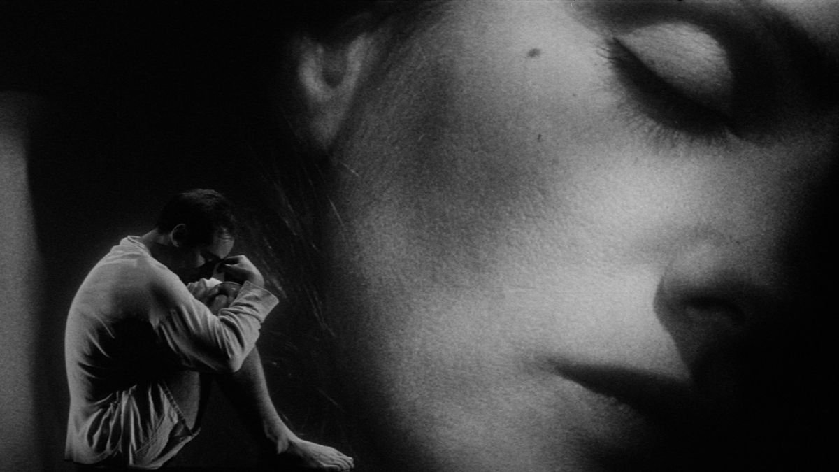
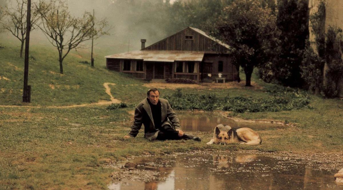
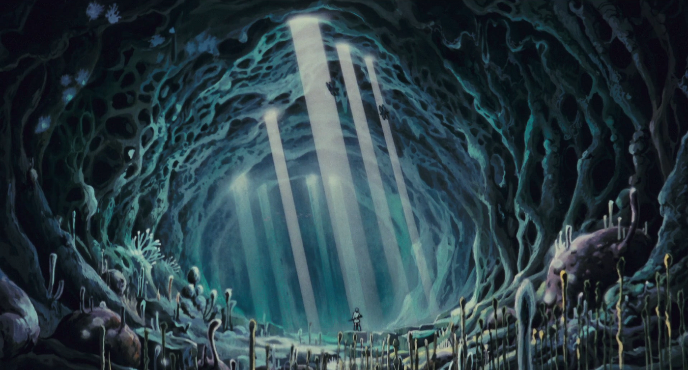
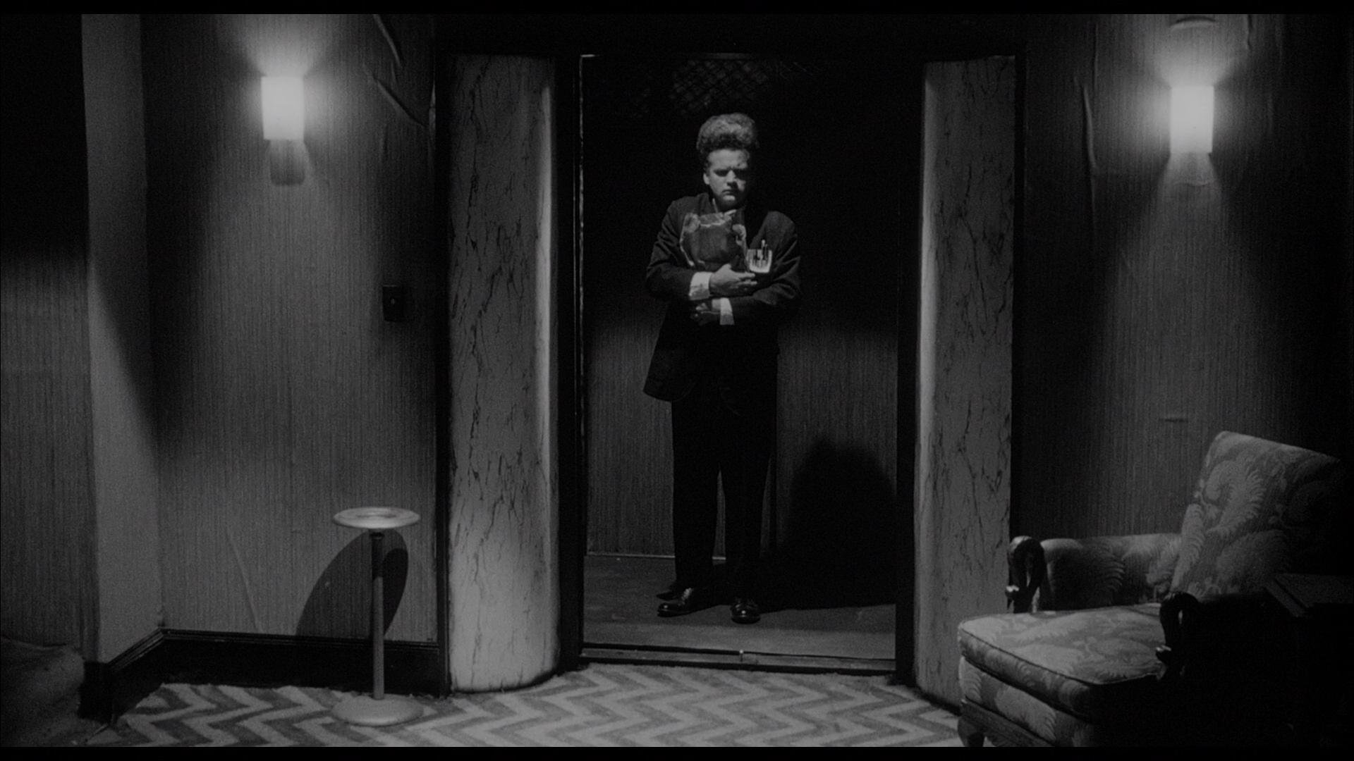
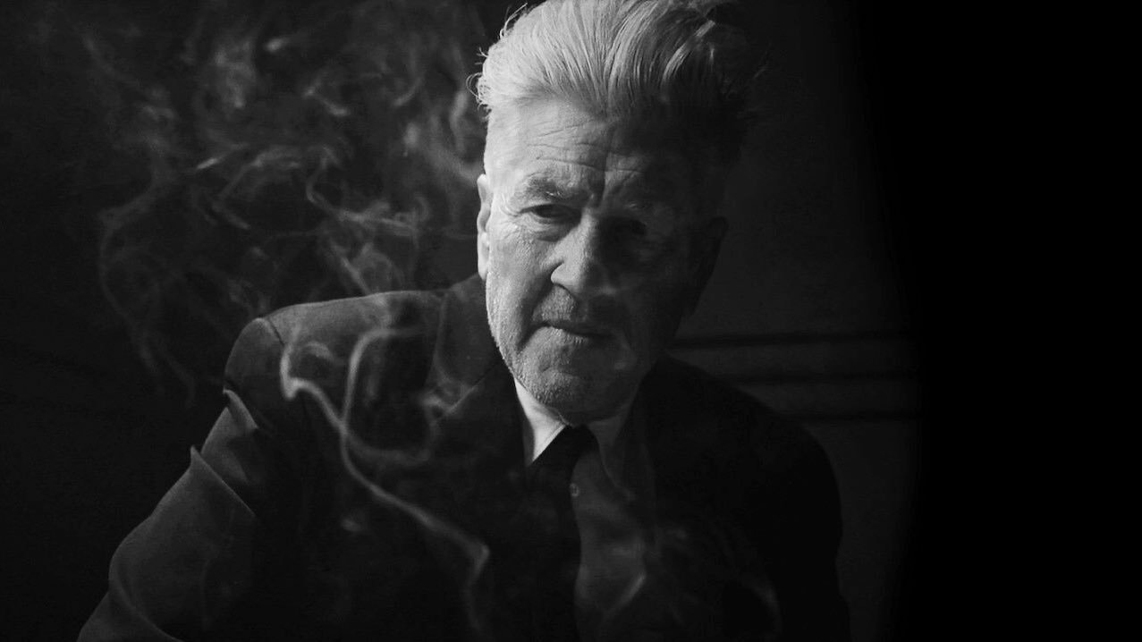
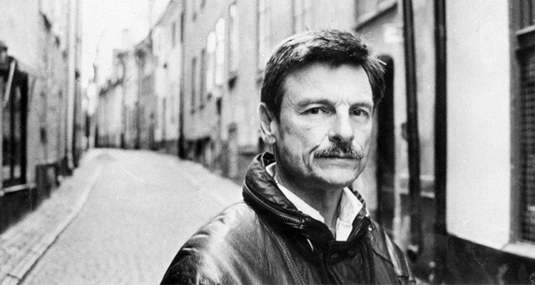
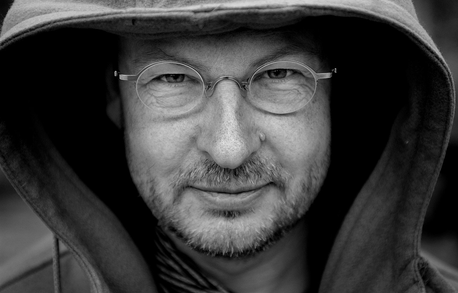
In retrospect - Directing, Art Directing, and even creating Styleframes seems like a natural evolution from where I started off as. My visual tendencies stem from the inspirations that clicked with me the most as I started developing as an artist, while studying film. My eternal companions, in order of their “discovery” - David Lynch (still one of my biggest inspirations), Andrei Tarkovsky (Stalker, Mirror and Nostalghia in particular), Lars Von Trier’s early works (The Element Of Crime, Epidemic, Europa, The Kingdom), Hayao Miyazaki (especially My Neighbour Totoro, Princess Mononoke, Nausicaä of the Valley of the Wind): they all helped me figure out what enchants me – it was the mood, the feeling, the atmosphere of a frame.
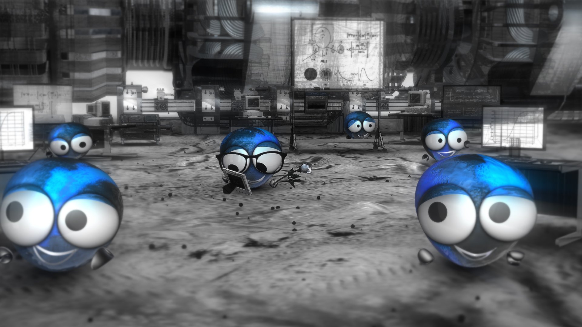
As a natural progression, I began to mimic some of the approaches, without really understanding them, maybe kind of like an AI would. Throughout the years though (has it really been 16 years already?!), after many frames created, I’d like to think that now, construction of the right atmosphere and myself go hand in hand on any project we have the opportunity to leave a mark on: whether it’s for a styleframe, directing a short film, and even when making an animated ad or an explainer.
Since I want to argue that inspiration does not equal emulation, let’s see if over the years, being inspired by the fore-mentioned auteurs of cinema managed to sip into the styleframes that I create for animation.
P.S.: And I’ll make sure to share some experiential tips and stories along the way.
Sketch & Go
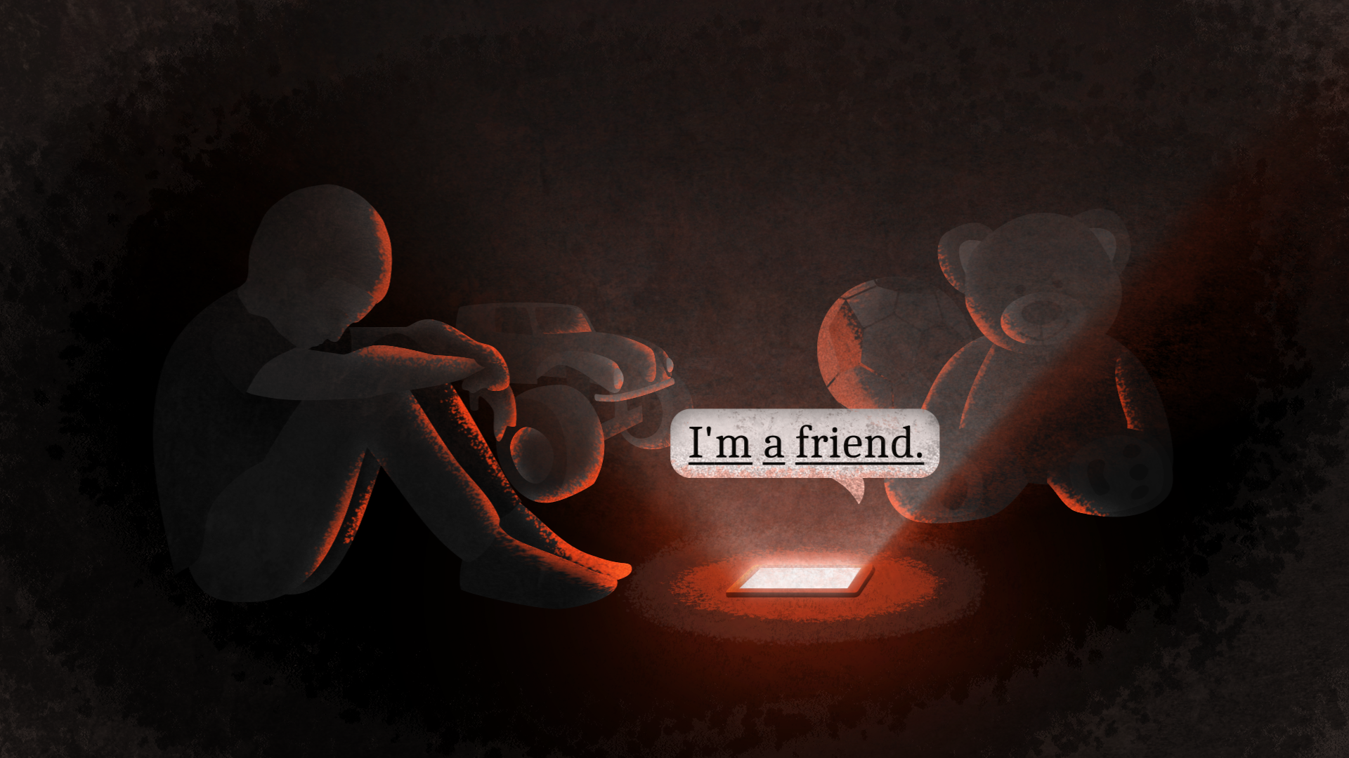
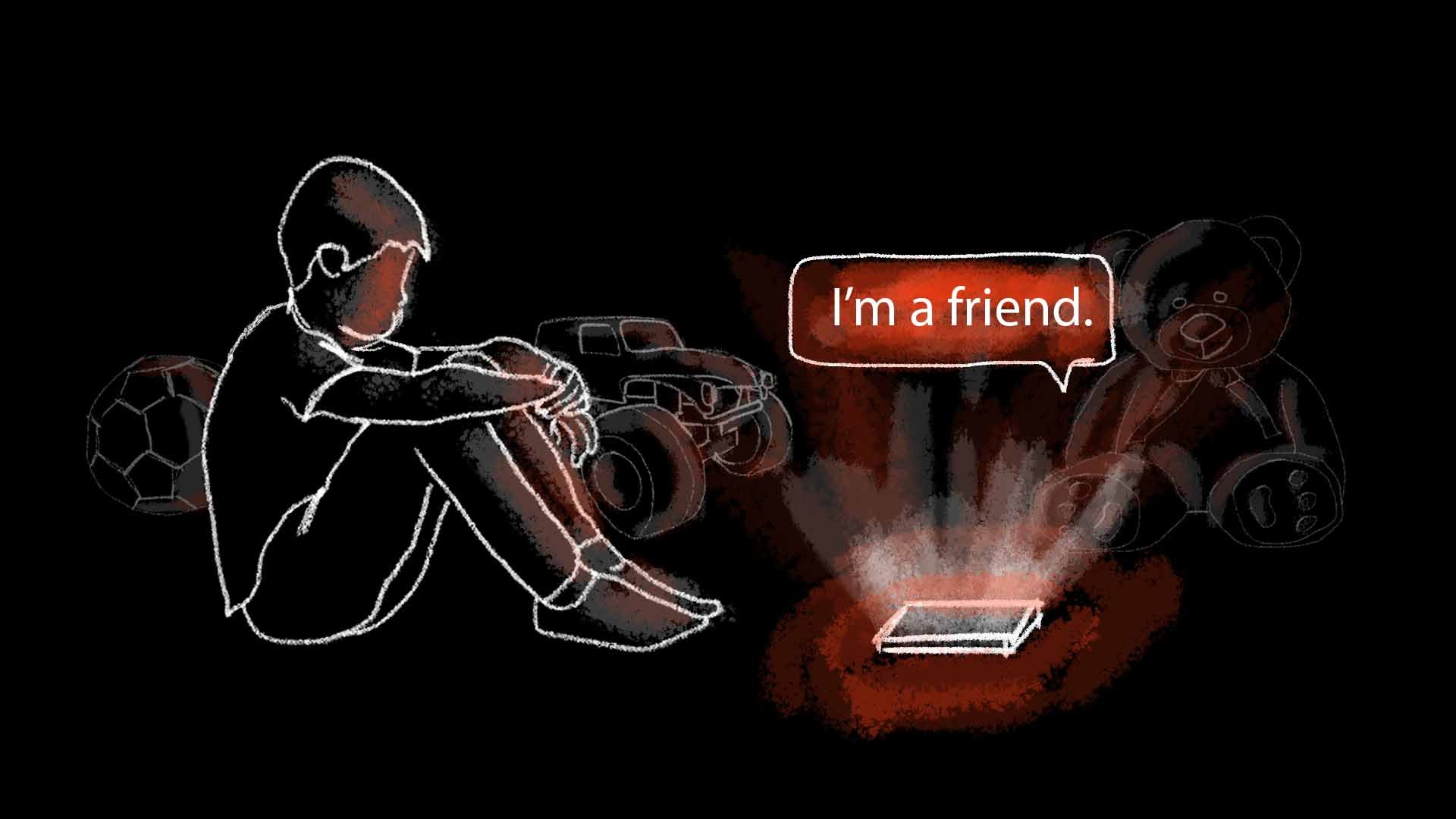
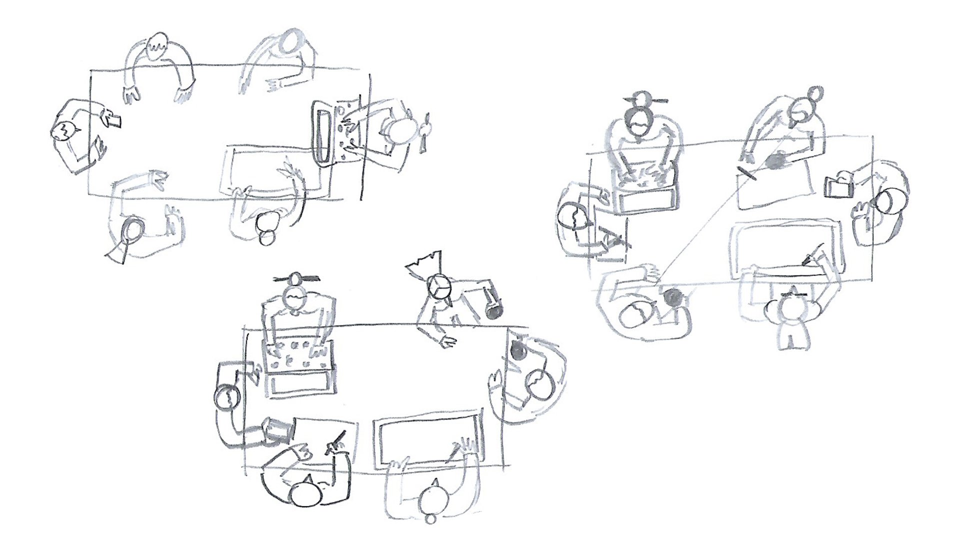
If there’s no time to do it by the book to include all the development steps, jumping straight into designing the layout of a shot, defining the composition and relationships between the elements, before defining the final visuals, is always a safe time investment. There’s definitely artists that are way trained and more suited to handle these steps (by focusing solely on doing this step), but sometimes, a rough sketch from a director, art director or a styleframe artist is enough to get the point across. Once done, there’s one less thing to figure out when building the actual styleframe.
With a layout in hand and moving onto defining the look and feel of a frame, it’s often useful to first define the main color palette. Personally, having three contrasting colors and their variations has always been a good place to start in defining the element that I’m a sucker for - the atmosphere. It’s each artists preference on how to continue building, but personally, I like to then focus on one or two background element’s details. Those become the benchmark for all the rest. Characters usually aren’t the first ones I jump in to define visually, as I prefer the world they “live in” to help and form them instead.
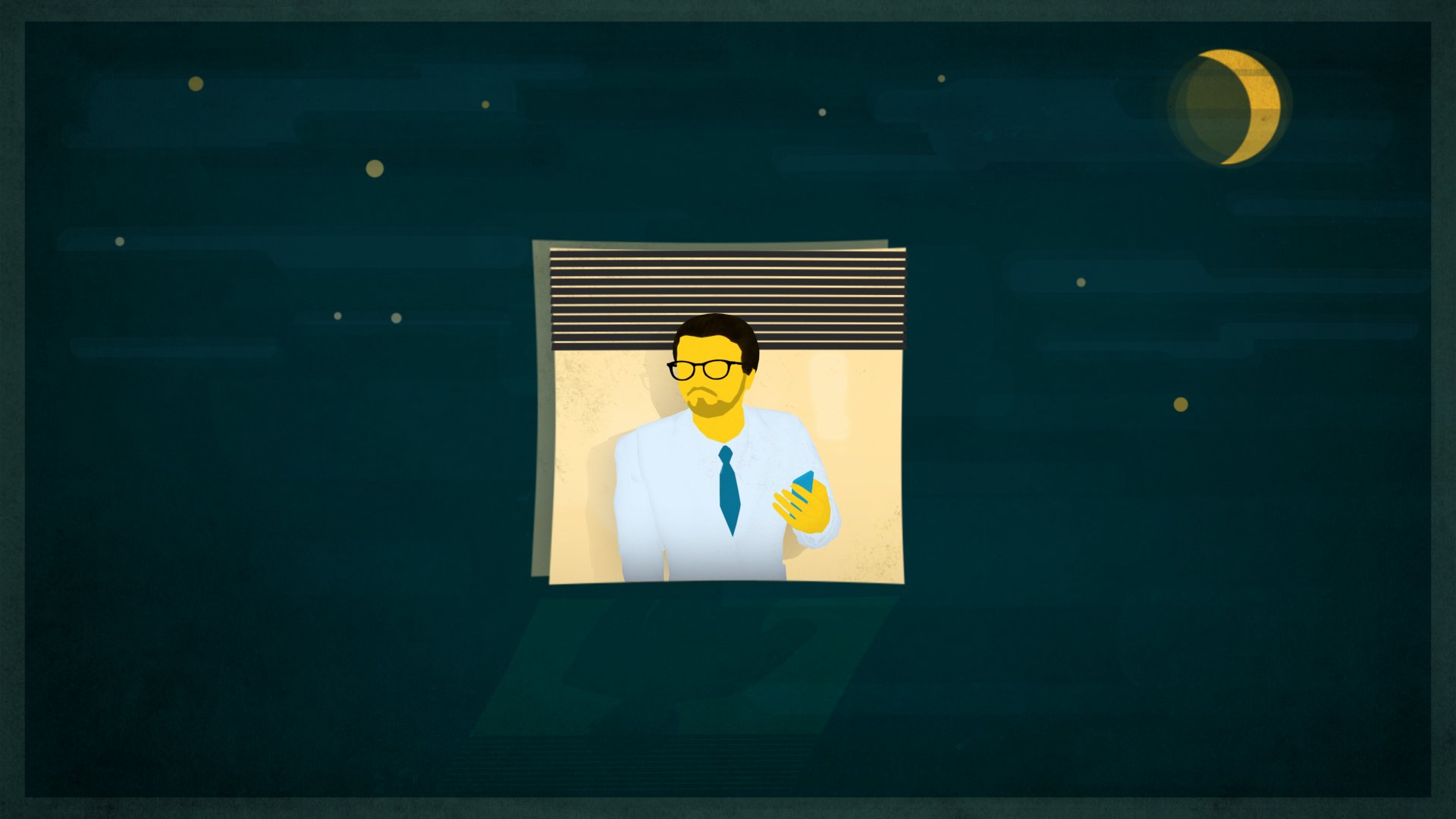
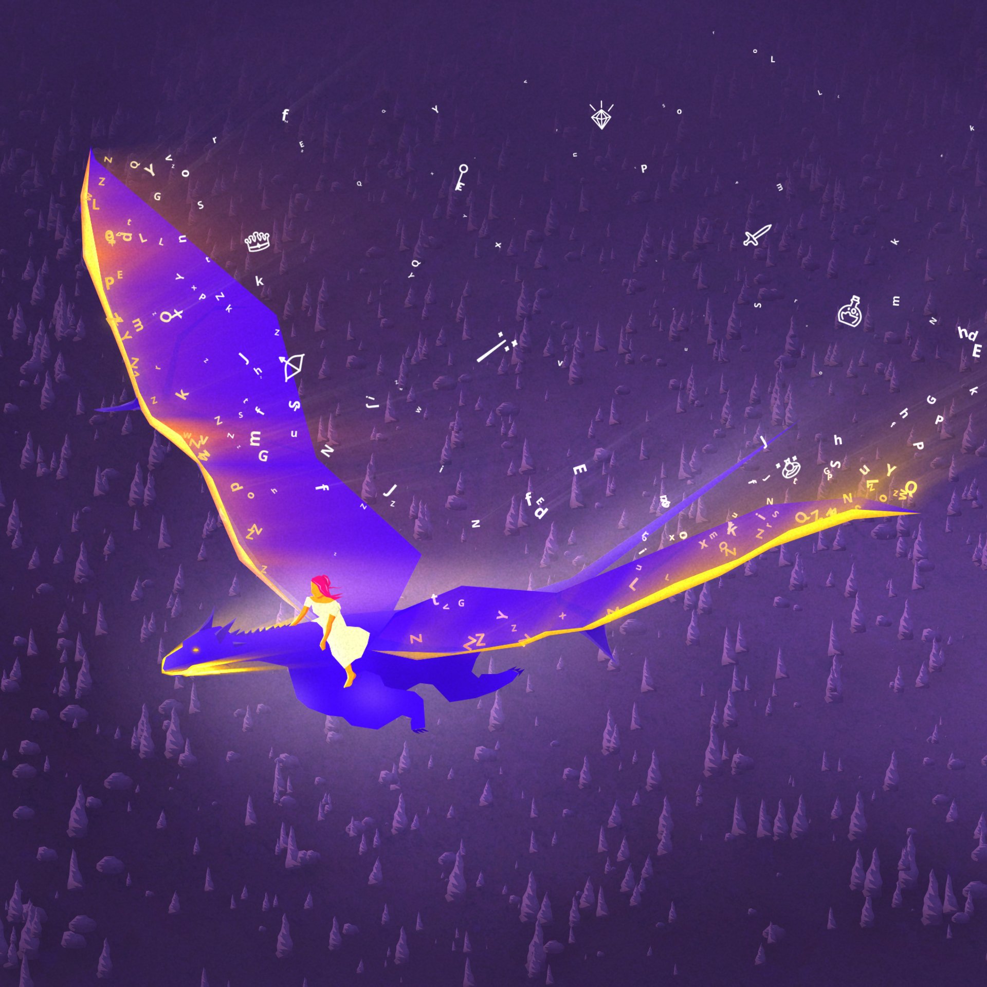
STORYBOARD - Century Initiative (Sandbox)
Fun fact: with these projects, we went straight into the animation phase, after making these styleframes. What about designing the assets, you may say? Well, most of the styleframes were done with the animation in mind, and so, I made them by designing the actual final assets while creating the styleframes, so they could then directly be used for the animation straight away. It was faster and more effective.
TIP: the visual narrative supports the general storytelling. Experiment: sometimes, it’s the colors that will guide a viewer best, sometimes it’s the composition, the texture… It all comes down to how a viewer should “feel”, and each visual approach will have its own results.
Explorations & VARIATIONS
Sometimes, a client or a director already know what they like. They might even have a storyboard sketched already, and a bunch of references handy. With these kind of projects, when working solely to construct a style to fit with someone’s visual preferences and then uplift them to fit with an idea, we can explore a visual style by making several variations of it. Then, in some cases, a brief or goal may change during the process, or we discover that a targeted visual style maybe wouldn’t fit with the idea of the story as neatly as was originally thought - so it’s back to the drawing board. But it’s all part of the process: we know why we moved on and the next result reflects that; by telling a story in a better suited way.
If at all possible, I always like to include a couple of options when sharing the first preview frame. This way, it shows how much visual maneuverability is available within the presented atmosphere, while it also opens up a conversation for potential new ideas that might support the vision of the final piece even better.
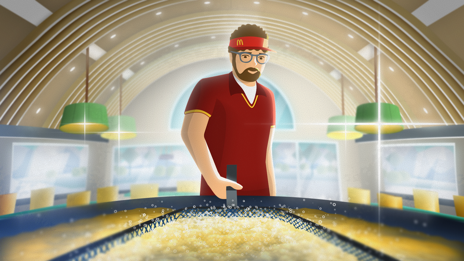
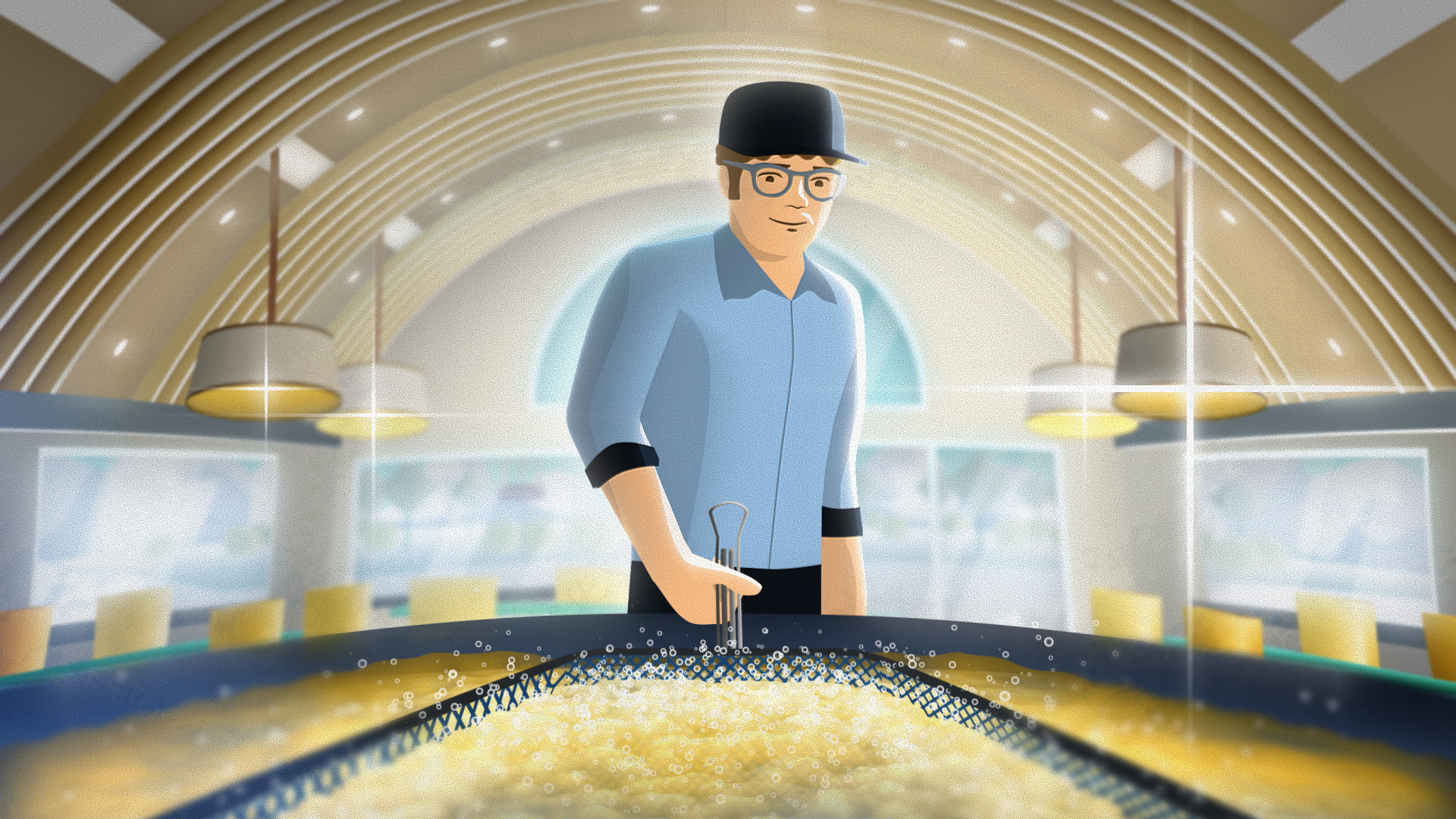
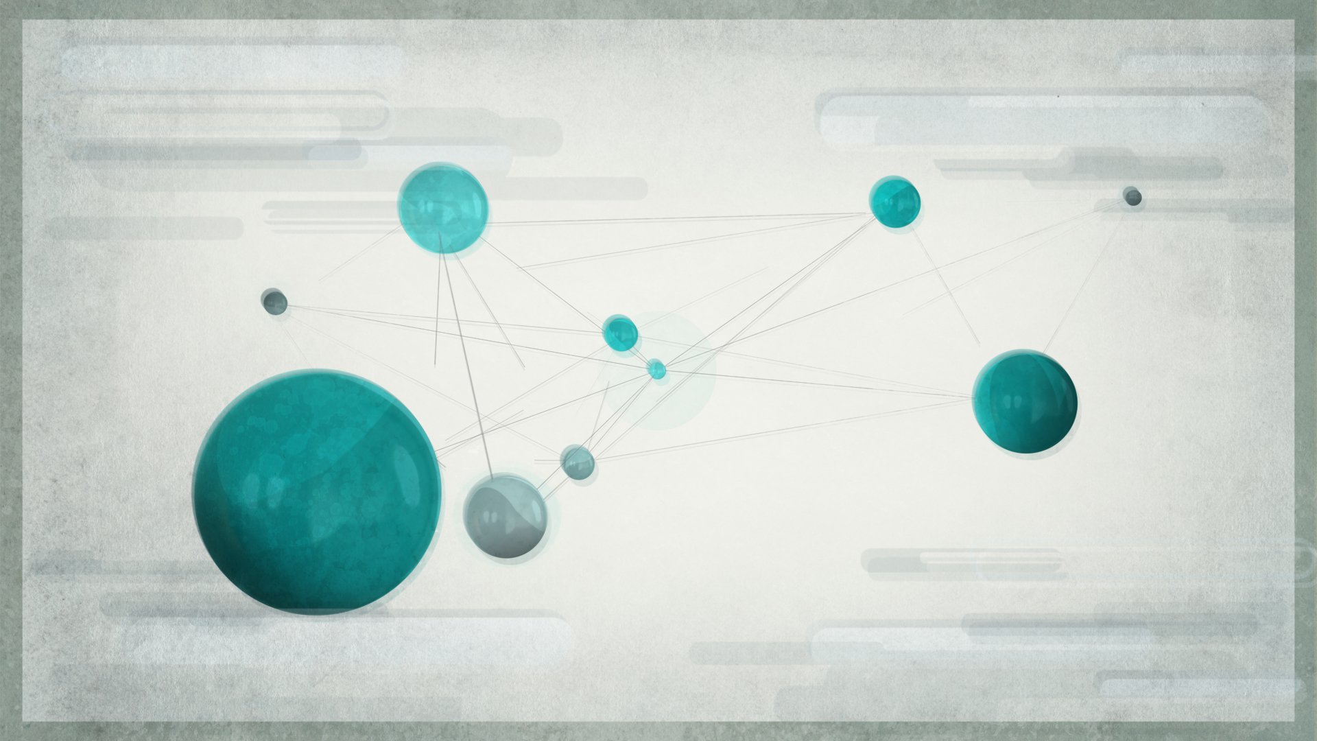
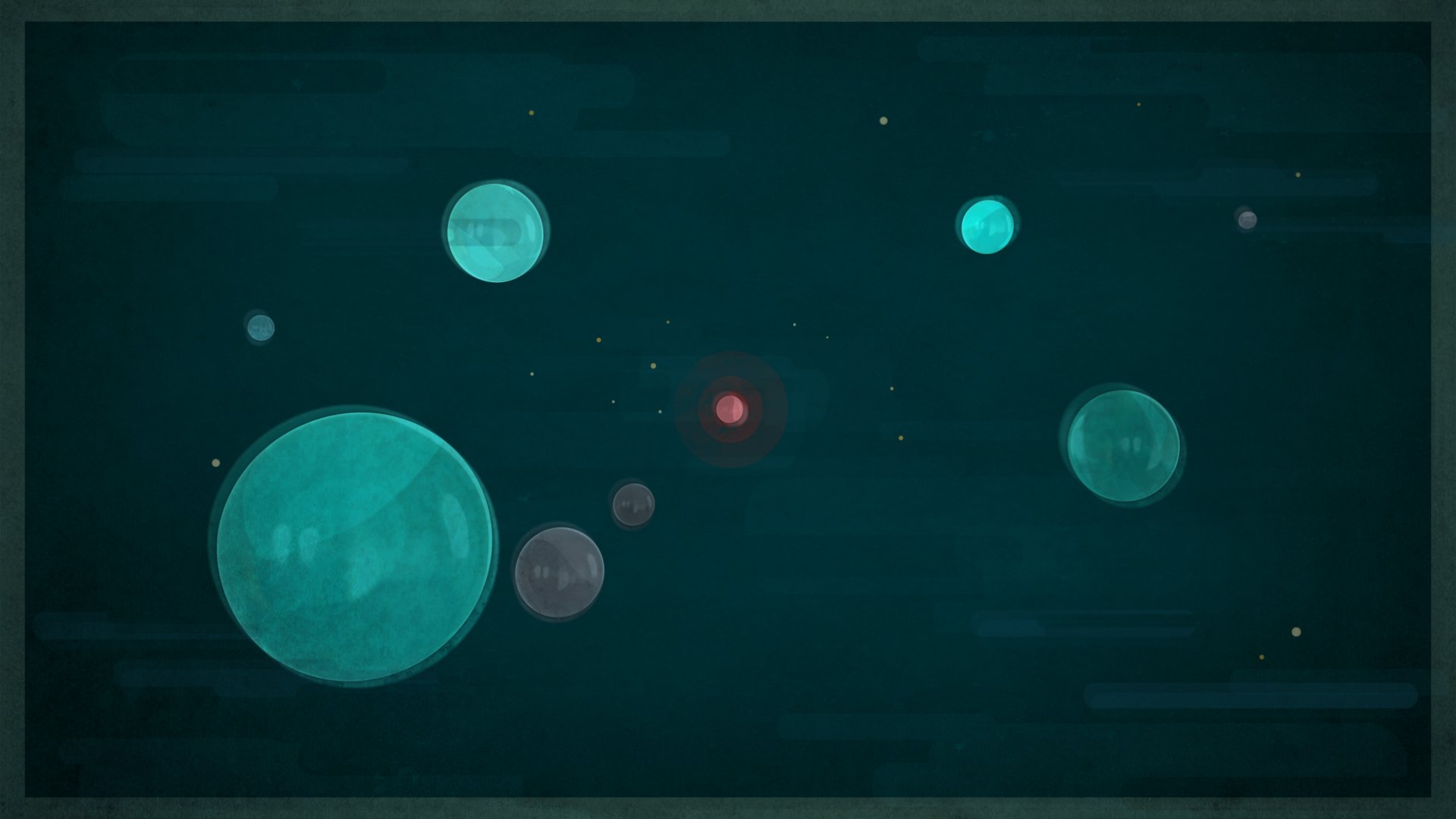
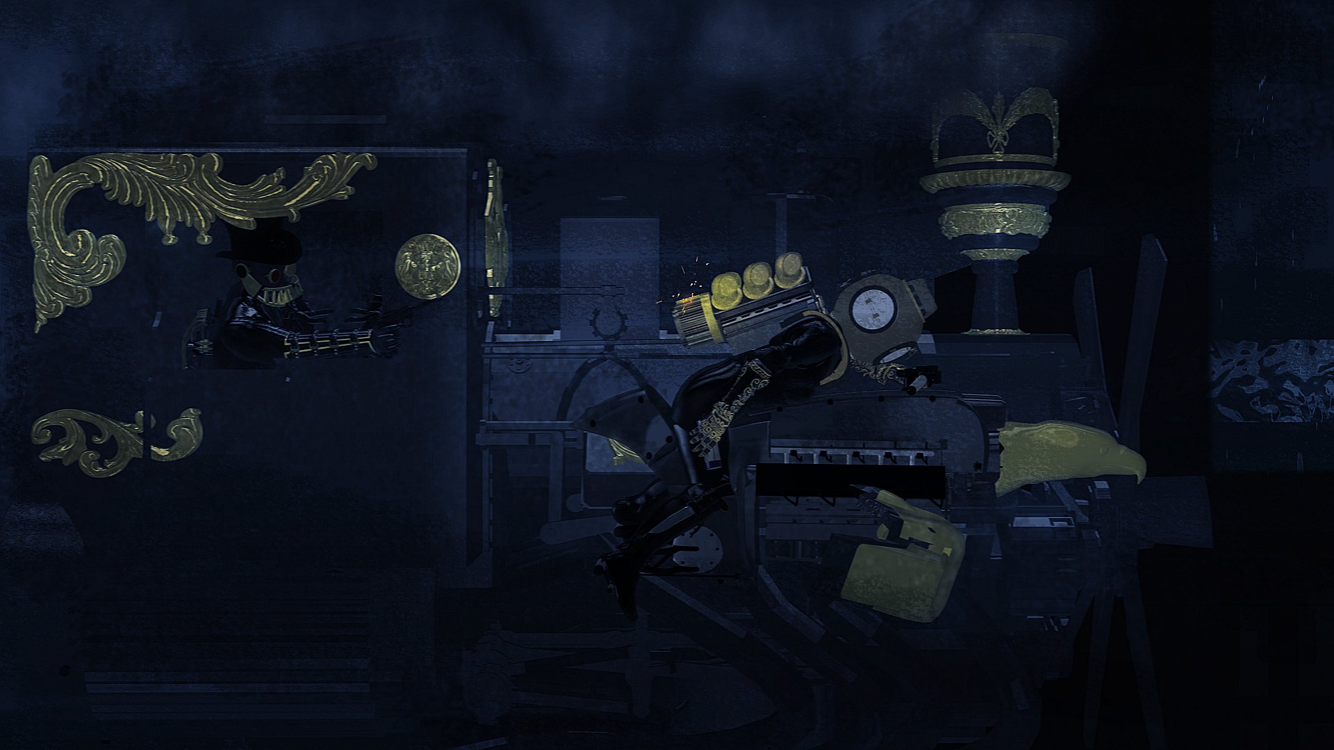
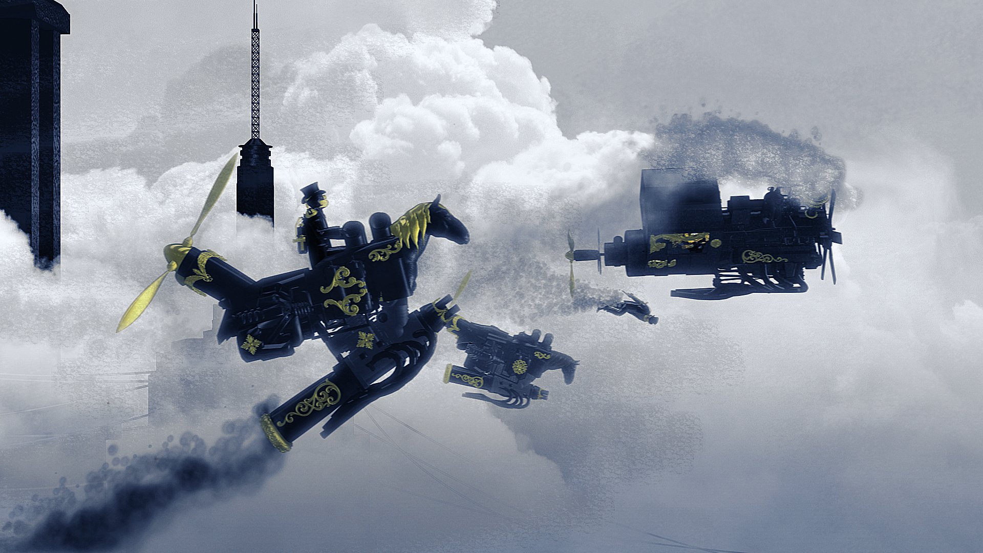
Fun fact: with all of these presented styleframes for instance, after making the first frame, we went on to create a series of styleframes for basically every shot of the piece, before we went on to the animation phase. And here, too, the styleframes were done with the animation in mind, so a lot of the assets were already prepped for use in the next magical step: bringing everything to life.
A TIP to all the non-AI’s: don’t aim to make the RIGHT thing, you’ll only be frustrated. Instead, aim to do as many WRONG things, so you clear your mind of all the BAD ideas. The remaining GOOD ideas will arise as a result of unclogging your imagination and understanding why the bad ideas didn’t work, and why you’re not going to repeat them.
Straight To The Goal
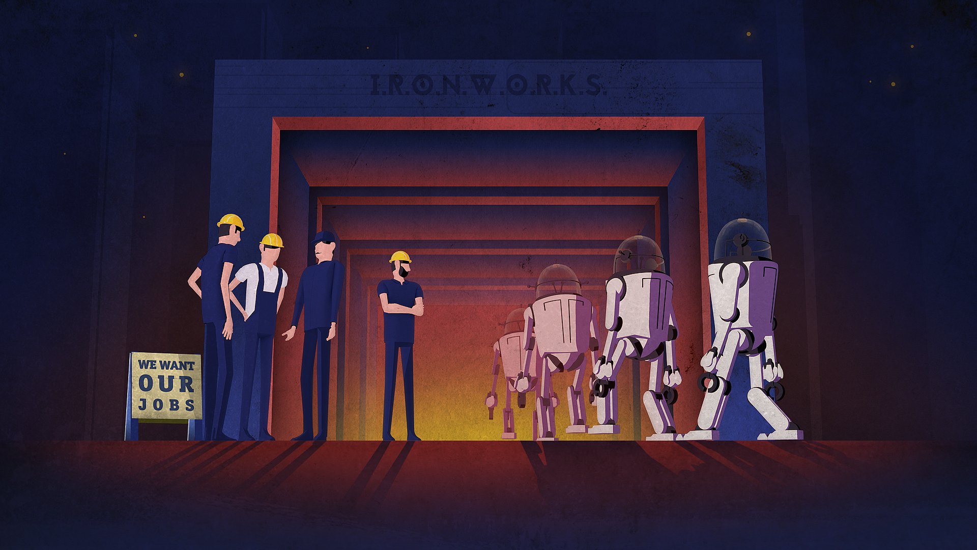
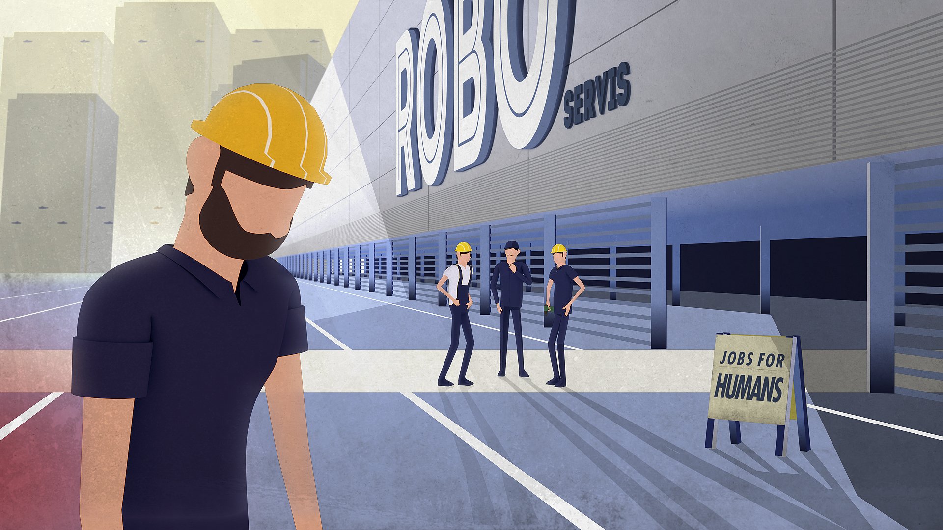
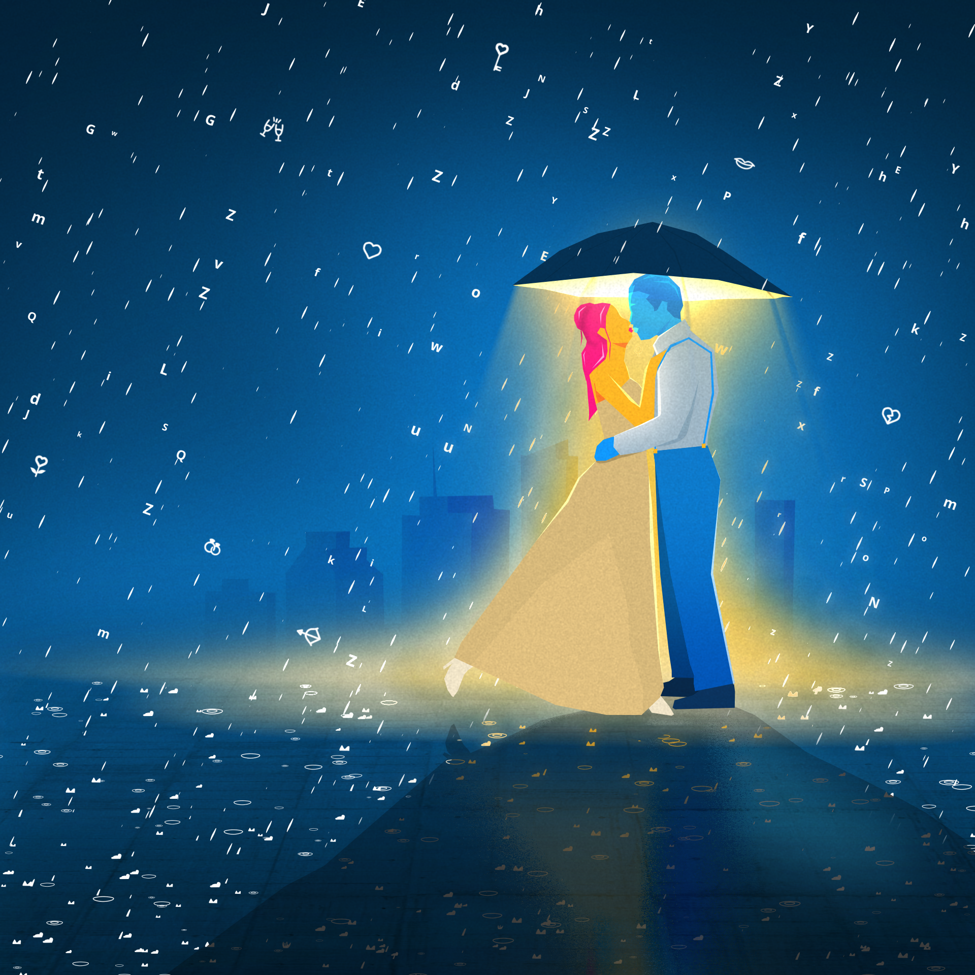
With some projects, the goal is to arrive at the best possible visual solution straight away and as soon as possible, with nothing solid in hand. We create 1-3 styleframes straight out of the gate, making potential smaller tune-ups and translations of the set visual benchmarks to other shots along the way. A lot of the times, external references aren’t even involved. Usually it’s due to a time-restraint or in some cases, because the goal IS the visual discovery phase itself - we just want to discover how a piece will look and “feel”.
With some of these projects I’m then involved throughout, either by directing, designing or even animating the project, while for others, I just jump on a project to design the stlyeframes (could be for a pitch to a client, or just to get the ball rolling to define the benchmarks for the look of a piece).
Fact: There’s no way around saying it – to me, these kind of projects are what I enjoy working on the most. Make just a frame or two, and it’s off to the races! Atmosphere defined, check! Frames from the resulting animation can’t exactly be treated as styleframes then, but at least when I continue to be involved, I try to treat each frame with the same care as if it were that first styleframe...
TIP: being focused just on one creative aspect creates tunnel vision. Try to breathe a bit of life into a styleframe straight away, to see how and if it actually translates to motion well. It can be for your eyes only. But YOU will know - it can either fuel you further, or lead to a better discovery.
Personal Projects – Starting With The Final PIECE In Mind
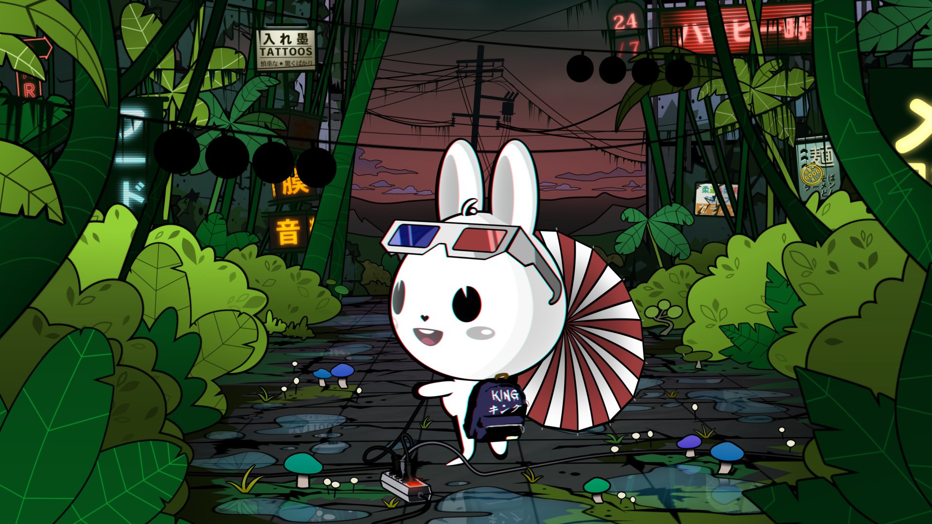
With personal films and projects, my usual process consists of a lot of overthinking and crowding up my mind with different ideas, before I finally sit down to create that first frame. I let the ideas, flashes and fragments take over me, encompassing most of my thoughts, almost to a point of bothering me and causing anxiety. Haha. I look at a lot of imagery: graphic designs, photography, book covers, graphic novels, 3d designs, concept designs, film stills etc. And with these anxiety-causing personal projects, I never sketch or do variations. After the weight of “idea formation” is almost too much to bare, I sit down to create just that first atmosphere-and-mood-defining-frame and… -straight away, start working on the actual animation! It’s actually similar to how I approach the type of projects described in the section above, but with personal projects, it includes several pinches of creative trauma. 🤣
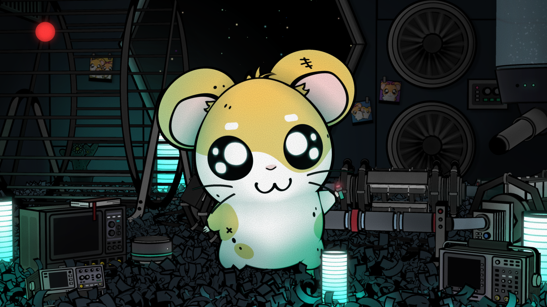
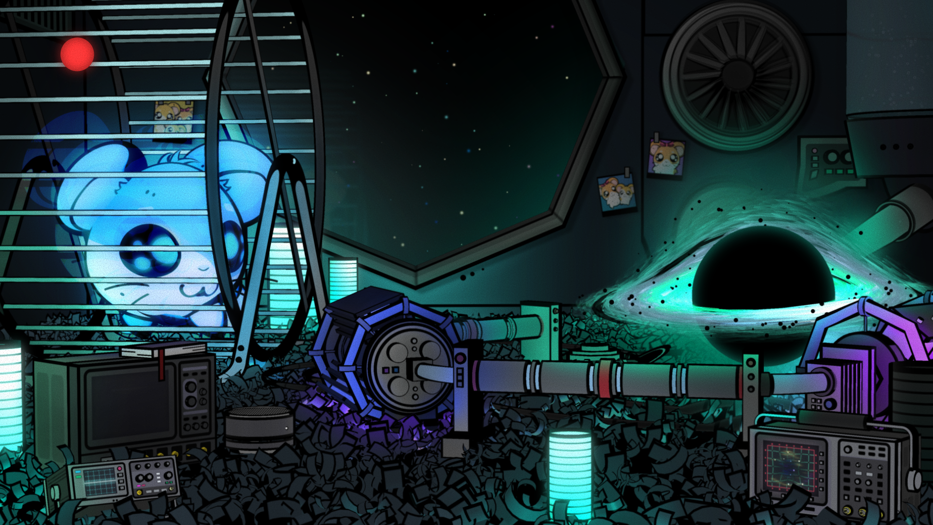
As with other projects, finding just the right feel for that first frame is the most important thing to me: a feeling that I want the viewer to feel must be translated into a frame, primarily through the use of composition, color, amount of detail, or texture. For me, other elements always come in second. If the atmosphere of a piece is targeted and executed correctly, one can even watch a hamster create a black hole by using his running wheel. Oh wait, I actually did that one...
Fun fact: Since a frame’s consisting elements (most may deem them as the most importing element though, the building blocks) come in only second when I work, especially when it comes to personal projects, I don’t shy away from “playing Legos“ with 3d objects, custom-built or even free-to-use 3d models. Some of the latter, I buy. But most, I find for free. But I never forget to mention the source of where I got them from. Let’s play fair.
TIP: for personal projects, deeply inspect how your ideas make you feel and what emotions are attached - it’s probably similar to how you want your viewers to feel. What is the one visual element that speaks the loudest? Start with that.
Conclusion
Learning something new is always useful, but only by repeating and refining can we blossom. By using a similar approach (atmosphere first) to all my work, I was able to grow in an area that enchanted me to start my artistic journey in the first place. AI imaging might very well use similar principles of learning. But learning how to emulate better does not come from being emotionally inspired. For art direction, I would argue it’s still the experience of CREATING (emotionally filtered through INSPIRATION), rather than CHOOSING (filtered through REFERENCE inputs), that helps stimulate growth in expression. But maybe someday my stance will change - only experiments and an open mind can lead to discoveries. 🤷
Finally - Not sure if my early inspirations pour through my frames in any obvious sense. I do know however - they will continue to be ingested and fuel my process. And throughout, my inspiration’s presence will be felt with gratitude.
So thank you, Lynch, Tarkovsky, Von Trier and Miyazaki!
For me, it was the MOOD / ATMOSPHERE. What’s a creative benchmark that has stuck with you throughout the years?


